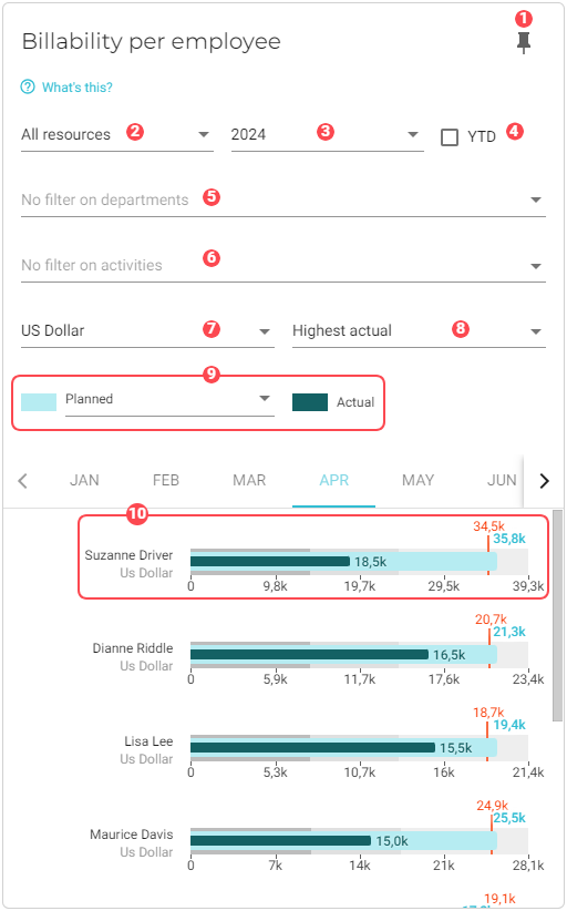
Billability per employee
This chart shows a monthly breakdown of working hours, target billable hours, and planned billable hours of each employee compared to their actual hours. It also gives totals for each department in all of these categories so you can compare not only by employee, but by departments within your organization.
To learn how billable hours are calculated, see How VOGSY determines billability.
This report is most often used by organizational managers who want a full breakdown of their employees’ billable time.
|
Pin icon. Click to pin this chart to a board. |
||||||||||||
|
Resource filter. Select whose data should be used in the chart. Options are:
|
||||||||||||
|
Displays data for the year that you select from this drop-down list. |
||||||||||||
|
If you select this checkbox, the time period for each bar graph will begin with the targeted month and end with the current month. 
|
||||||||||||
|
By default, data from all departments is used in the dataset. See Filter data by departments to learn how to remove specific department data from the dataset. |
||||||||||||
|
By default, data for all activities is used in the dataset. See Filter data by activities to learn how to remove specific activity data from the dataset. |
||||||||||||
|
Presentation setting. Select how you want to present the data:
|
||||||||||||
|
Select how you want the data sorted:
|
||||||||||||
|
Select what type of billability to show for each employee:
|
||||||||||||
|
An employee graph. One graph displays for each employee in your company. 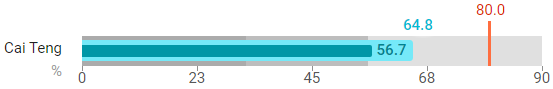
|


Filter data by departments
To select the departments whose data you want to visualize in the chart, do the following:
-
Click the
 Filter button for the department filter. A dialog window will display with a list of the departments that you have configured for your company.
 -
Select the departments that you want to add to the chart.
-
Click OK. The chart will refresh with the updated presentation.
Filter data by activities
To select the activities whose data you want to visualize in the chart, do the following:
-
Click the
Filter button for the activities filter. A dialog window will display with a list of the activities that you have configured for your deliverables. -
Select the activities that you want to add to the chart.
-
Click OK. The chart will refresh with the updated presentation.