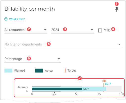
Billability per month
This chart gives insight into your company’s billable hours per month.
To learn how billable hours are calculated, see How VOGSY determines billability.
To compare the billability between years, you can toggle between the current year and previous year.
|
Pin icon. Click to pin this chart to a board. |
||||||||||||
|
Resource filter. Select whose data should be used in the chart. Options are:
|
||||||||||||
|
Displays data for the year that you select from this drop-down list. |
||||||||||||
|
If you select this checkbox, the time period for each bar graph will begin with the targeted month and end with the current month. 
|
||||||||||||
|
By default, data from all departments is used in the dataset. See Filter data by departments to learn how to remove specific department data from the dataset. |
||||||||||||
|
Presentation setting. Select how you want to present the data:
|
||||||||||||
|
A month graph. One graph displays for each month of the year. 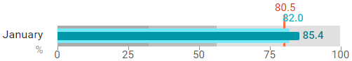
|


Filter data by departments
To select the departments whose data you want to visualize in the chart, do the following:
-
Click the
 Filter button for the department filter. A dialog window will display with a list of the departments that you have configured for your company.
 -
Select the departments that you want to add to the chart.
-
Click OK. The chart will refresh with the updated presentation.