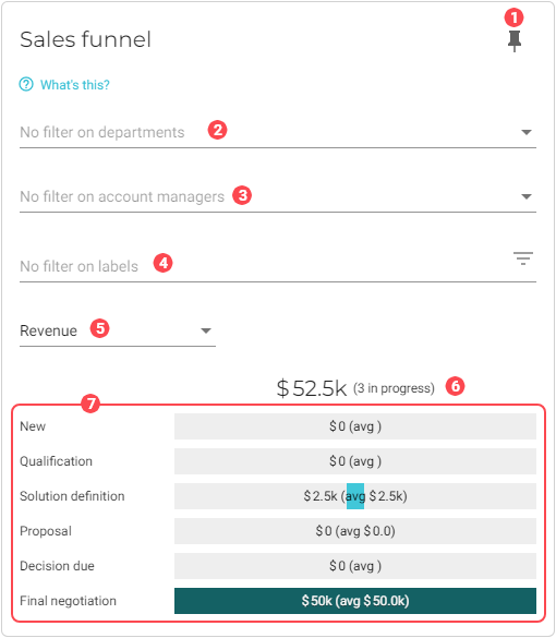
Sales funnel
This chart shows all active opportunities sorted by stage. It illustrates the concept of the sales cycle as a journey from identifying potential customers to negotiating and signing a deal. Each stage of the journey involves a smaller pool of opportunities, thus giving the graph the shape of a funnel.
|
To ensure this chart is accurate, do the following:
|
| To configure the list of opportunity stages, go to the Opportunity stages back office module. |
|
Pin icon. Click to pin this chart to a board. |
||||||||
|
By default, data from all departments is used in the dataset. See Filter data by departments to learn how to remove specific department data from the dataset. |
||||||||
|
By default, data for account managers is used in the dataset. See Filter data by account managers to learn how to remove specific account managers from the dataset. |
||||||||
|
By default, all data, regardless of applied labels, is used in the dataset. See Filter data by label to learn how to restrict the data based on labels. |
||||||||
|
Visualization type. Toggles between the following:
|
||||||||
|
Depends upon the Visualization type.
|
||||||||
|
Opportunity stage bar graph. The meaning of the values displayed inside the bar graph depend upon the Visualization type that you select:
Click a bar graph to view the list of opportunities that are in that stage. For example, if you click the bar graph for the New stage, you will be taken to a filtered view of the Opportunities page that displays only opportunities that are in the New stage: 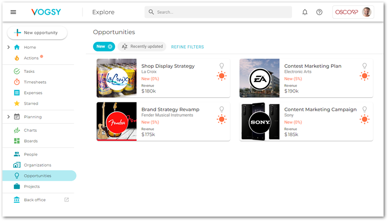
|


Filter data by departments
To select the departments whose data you want to visualize in the chart, do the following:
-
Click the
 Filter button for the department filter. A dialog window will display with a list of the departments that you have configured for your company.
 -
Select the departments that you want to add to the chart.
-
Click OK. The chart will refresh with the updated visualization.
Filter data by account managers
To select the account managers whose data you want to visualize in the chart, do the following:
-
Click the
Filter button for the account manager filter. A dialog window will display with a list of your company’s account managers. -
Select the account managers that you want to add to the chart.
-
Click OK. The chart will refresh with the updated visualization.
Filter data by label
To select the data you want to visualize in the chart based on one or more labels, do the following:
-
Click the
Filter button for the Labels filter. A dialog window will display with a list of labels that have been applied to opportunities. -
Select the labels that you want to add to the chart.
-
Click OK. The chart will refresh with the updated visualization.