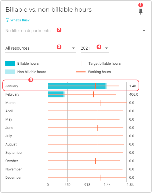
Billable vs. non billable hours
This chart gives you detailed insight into how efficiently your employees are using their work hours. It displays data about the number of overall hours worked, as well as billable vs. non-billable work hours.
To learn how billable hours are calculated, see How VOGSY determines billability.
|
Pin icon. Click to pin this chart to a board. |
|
By default, data from all departments is used in the dataset. See Filter data by departments to learn how to remove specific department data from the dataset. |
|
By default, all resources are used in the dataset. See Filter data by resources to learn how to remove specific resources from the dataset. |
|
Displays data for the year that you select from this drop-down list. |
|
A graph that displays data about the selected month’s resources and activities. One graph displays for each month of the year. |


Filter data by departments
To select the departments whose data you want to visualize in the chart, do the following:
-
Click the
 Filter button for the department filter. A dialog window will display with a list of the departments that you have configured for your company.
 -
Select the departments that you want to add to the chart.
-
Click OK. The chart will refresh with the updated presentation.