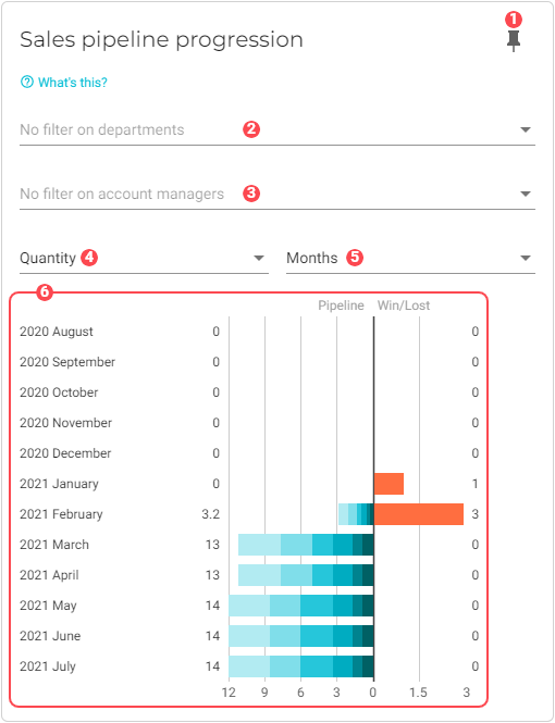
Sales pipeline progression
This chart illustrates the evolution of sales through the sales funnel in terms of wins and losses so that you can see trends or deviations that should be brought to the attention of the sales team.
Note that when sorting by months or weeks, there are two ways to calculate the number of opportunities and the total revenue value from the sales pipeline.
-
Averages: VOGSY calculates the average number of opportunities and total revenue value based on the number of days the opportunity was in the selected stage during the selected week or month. This gives a weighted view on the progression within each stage. This is the default method. Go to the Charts back office module if you want to change this.
-
End of period: The number of opportunities and revenue value is determined on the last day of the month or week.
|
To ensure this chart is accurate, do the following:
|
|
Pin icon. Click to pin this chart to a board. |
||||||||||||
|
By default, data from all departments is used in the dataset. See Filter data by departments to learn how to remove specific department data from the dataset. |
||||||||||||
|
By default, data for account managers is used in the dataset. See Filter data by account managers to learn how to remove specific account managers from the dataset. |
||||||||||||
|
Scale. The timespan of the data used to generate the graph. |
||||||||||||
|
Visualization type. Toggles between the following:
|
||||||||||||
|
Monthly progression graph. The data displayed for each bar graphs depends upon two things:
See View full details for a selected month to learn more about this chart. |


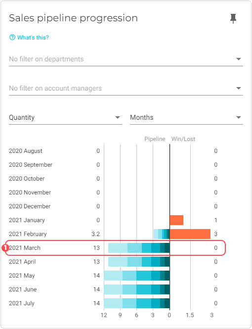
View full details for a selected month
-
Click the month that you want to view.
-
Click a bar graph to view the details for the selected month:
-
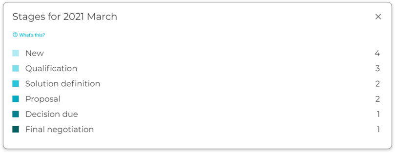
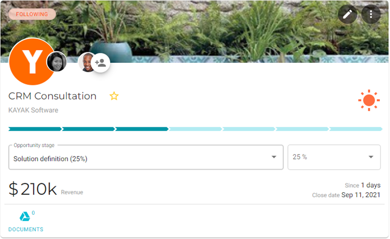
To seewhich opportunities are in a particular stage, click the stage:
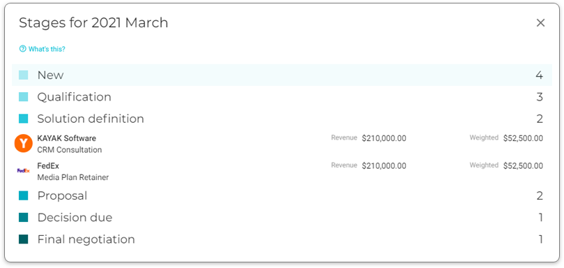
This list displays the actual revenue, which might be different from what displays on the chart itself for the selected time period. -
To view the opportunity page for a particular opportunity, click it.
Filter data by departments
To select the departments whose data you want to visualize in the chart, do the following:
-
Click the
 Filter button for the department filter. A dialog window will display with a list of the departments that you have configured for your company.
 -
Select the departments that you want to add to the chart.
-
Click OK. The chart will refresh with the updated visualization.
Filter data by account managers
To select the account managers whose data you want to visualize in the chart, do the following:
-
Click the
Filter button for the account manager filter. A dialog window will display with a list of your company’s account managers. -
Select the account managers that you want to add to the chart.
-
Click OK. The chart will refresh with the updated visualization.