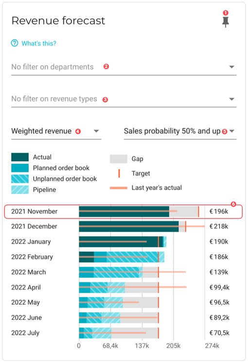
Revenue forecast
This chart shows you your potential and actual revenue based on your sales pipeline and active projects. You can use this chart to judge if you are on course to meet your revenue targets. The timely insights from this chart will allow you to make adjustments to your business strategy, if necessary. For example, if you see that the sales pipeline is almost empty, you can scale up your sales effort to bring in more projects. If you have a robust pipeline, maybe you will need to hire more employees to make sure your projects are completed on schedule.
|
To ensure this chart is accurate, do the following:
|
|
Pin icon. Click to pin this chart to a board. |
||
|
By default, data from all departments is used in the dataset. See Filter data by departments to learn how to remove specific department data from the dataset. |
||
|
Revenue Type filter. This filter is only available if you have created two or more revenue types for your projects. When the filter is applied, the following data will be affected:
You can select more than one revenue type to filter on. |
||
|
Revenue selector. Choose from the following:
|
||
|
Sales probability slider. Set this slider to filter out opportunities whose sales probability falls below a desired percentage. |
||
|
The chart displays a bar graph for each month. The following data is displayed in each graph:
Click on the month to view its Forecast details window: 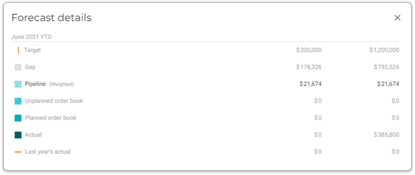
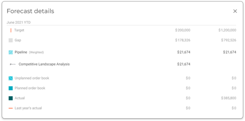
You can click the following line items to display a list orders for the month in question:
You can click an order to be taken to its opportunity card for more details. 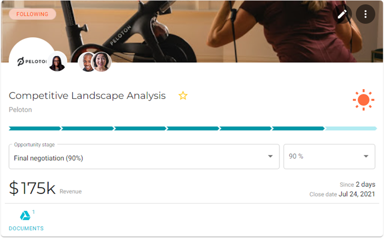
|


Filter data by departments
To select the departments whose data you want to visualize in the chart, do the following:
-
Click the
 Filter button for the department filter. A dialog window will display with a list of the departments that you have configured for your company.
 -
Select the departments that you want to add to the chart.
-
Click OK. The chart will refresh with the updated presentation.