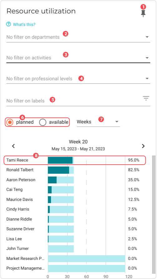
Resource utilization
This chart shows the planned or available resource utilization by week or by month. Use this chart to learn how your resources are being used based on your planned projects and the available work hours of your employees.
| To ensure this chart is accurate, make sure to resource all projects and opportunities so that you can best understand the dynamics between your planned revenue and actual revenue. |
|
Pin icon. Click to pin this chart to a board. |
|
By default, data from all departments is used in the dataset. See Filter data by departments to learn how to remove specific department data from the dataset. |
|
By default, data for all activities is used in the dataset. See Filter data by activities to learn how to remove specific activity data from the dataset. |
|
By default, data for employees at all professional levels is used in the dataset. See Filter data by professional levels to learn how to focus the data on employees with specific professional levels. |
|
By default, all data, regardless of applied labels, is used in the dataset. See Filter data by label to learn how to restrict the data based on labels. |
|
You can choose between two types of hours: Planned or Available. |
|
You can sort the data by the following time periods: Weeks or Months. |
|
Resource graph. Displays the resources name and utilization percentage. Click the resource to view their planning: 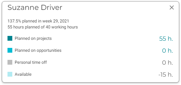
Click a row for more details: 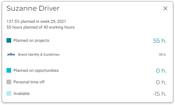
|


Filter data by departments
To select the departments whose data you want to visualize in the chart, do the following:
-
Click the
 Filter button for the department filter. A dialog window will display with a list of the departments that you have configured for your company.
 -
Select the departments that you want to add to the chart.
-
Click OK. The chart will refresh with the updated presentation.
Filter data by activities
To select the activities whose data you want to visualize in the chart, do the following:
-
Click the
Filter button for the activities filter. A dialog window will display with a list of the activities that you have configured for your deliverables. -
Select the activities that you want to add to the chart.
-
Click OK. The chart will refresh with the updated presentation.
Filter data by professional levels
To leave out resources based on professional level, do the following:
-
Click the
Filter button for the professional levels filter. A dialog window will display with a list of the levels that you configured in the back office. -
Select the appropriate professional levels.
-
Click OK. The chart will refresh to display only the resources who are at the professional levels you selected.
Filter data by label
To select the data you want to visualize in the chart based on one or more labels, do the following:
-
Click the
Filter button for the Labels filter. A dialog window will display with a list of labels that have been applied to opportunities. -
Select the labels that you want to add to the chart.
-
Click OK. The chart will refresh with the updated visualization.